Ryanair and EasyJet belong to the top 10 European airlines that flew the most passenger
in Europe in 2022, as well as the top 10 airlines in Europe in terms of revenue (Statista, 2022; Wikipedia,2022).
Such achievements are due to the low fair costs offered, the number of destinations reached and the user usability
and ease of booking that those airlines offer.
Both airlines do offer an interactive map for their users. Still, each design differs in terms of colour
scheme, functionalities and use cases, and visualization methods, and each offers a set of different strengths and
limitations. Starting from the use cases, on both websites, users are presented with a map of destinations, which
are presented as bubbles, and can select their itinerary, including destinations and dates. EasyJet also includes
a car renting option and a holiday-planning solution, while RyanAir offers different filtering in a table format,
including available budgets and trip types. Both airlines use their logo's primary colours for their selected colour
scheme, with Ryanair using blue and yellow variants, while EasyJet uses orange and grey.
On the strengths of the visualizations, the visuals are presented in a suitable logical format, with the
visualization and filtering options being appropriate for the target audience and ordinary users. The colour schemes
effectively represent each company's brand, and the navigation between different visualizations is effortless.
Some limitations are present in the current designs, with the main of those revolving around accessibility issues.
First, none of the websites follows DOM order end to end, with the tab keys navigation being trapped in specific
parts of the page, causing errors or having non-focuses areas. Additionally, specific pop-up messages (e.g. error
messages on EasyJet's website) do not switch the focus to the message itself, but rather, the entire page remains
visible, which goes against accessibility guidelines. Finally, EasyJet's website lacks sufficient contrast between
the background and the foreground (Accessibility Checker, N.D.).
To summarize, both websites display information clearly and concisely, utilizing visualizations and basic
visualization guidelines. However, enhancements should take place regarding visualization accessibility, as with
the present concerns, visually or motion-impaired users may face difficulties using the visualizations.
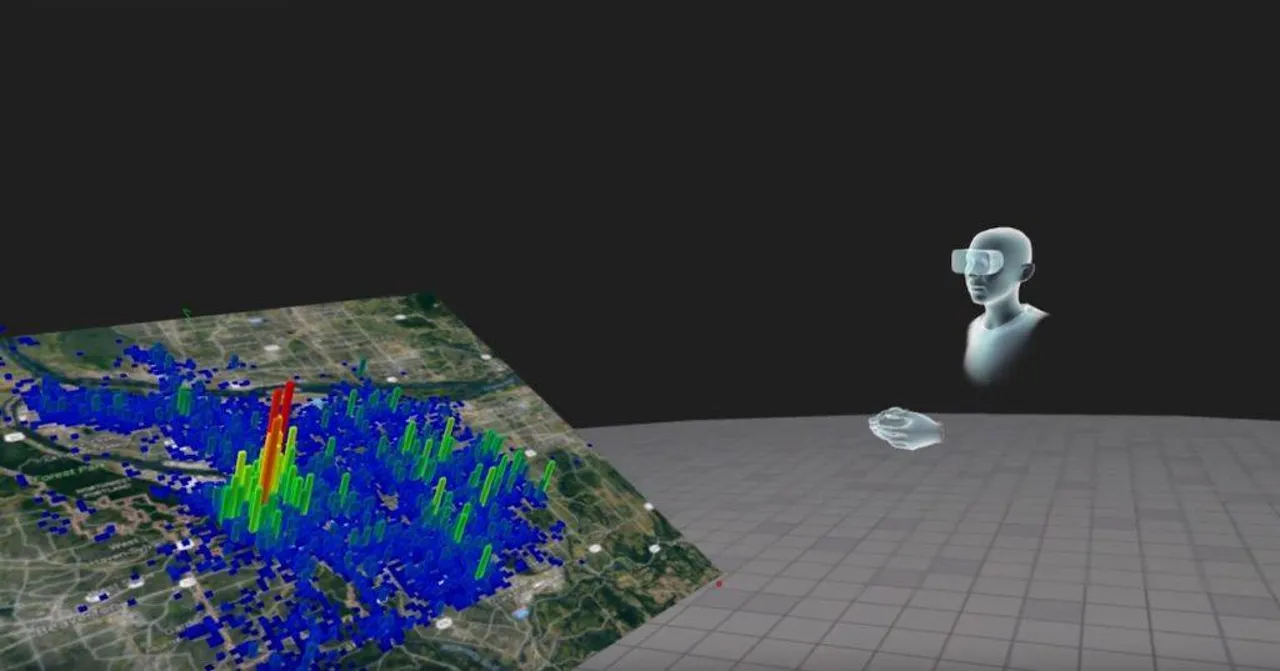
With more than 171 million Virtual Reality (VR) users worldwide and more than 110
Augmented Reality (AR) users in the US, the usage of such technologies by the general public is constantly
increasing. With the increased usage of AR and VR, businesses and organizations have also leveraged the
uniqueness of such technologies, with the transportation, automotive and oil industries being only some
of those (Kolmar, 2023).
Such applications are far from typical or widespread in the humanitarian field,
although innovation is constantly encouraged. AR and VR can serve well the humanitarian sector,
as the sector's uniqueness allows for several disciplines, from finance to the law, to be gathered
under one entity that serves the humanitarian purpose. One of the most significant works of humanitarian
organizations involves advocacy efforts. Through VR/AR, organizations can help policymakers, politicians and the
general public to put themselves in someone else's shoes, from how it is to live in camp settings to what it is
like crossing countries on foot and what poverty looks like. Moreover, another part of humanitarian work involves
data analysis. AR/VR can help data managers and decision makers 'experience' the data (Nichols, 2019), providing a
better understanding and supporting decision-making. Finally, many humanitarian organizations provide medical support
in remote locations. With sparse human resources, AR/VR can support doctors and other healthcare practitioners to
provide remote support to resources on the ground. AR/VR in the medical field is not new, but expanding it in
humanitarian organizations can help save lives (Mesko, 2021).
In a nutshell, the humanitarian field is one of the areas where AR/VR is less utilized.
Though the opportunities are numerous, and some of AR's/VR's applications are already applied in different
disciplines operating in the humanitarian sector. An increase in the use of AR/VR can speed up decision-making,
provide solutions to support affected populations and help increase the public's awareness of refugee and migration
issues.
Abstract
Our study is based on a dataset originating from a Portuguese bank, spanning from 2008 to 2013,
containing a random sample of 4100 observations, including an output target, indicating if a customer has bought a
long-term deposit account, and 19 input features, containing several indicators, from telemarketing specific and
product details to client demographics and socio-economic indicators, providing a comprehensive set of variables
for our analysis. We aim to enhance telemarketing efforts by integrating machine learning models into the decision-making
process and accurately predicting a phone call's outcome, therefore enabling a more targeted customer selection and
prioritisation during campaigns (Essex, 2022). The ultimate goal is to increase the effectiveness of these campaigns
while reducing associated costs and time. In order to achieve our goal, our project contains two closely interlinked
parts, one of Exploratory Data Analysis (EDA) and one of statistical modelling.
Working through this module and comparing the beginning of this module's journey with the end, I understand that it has been a road full of knowledge, coupled with steep
learning curves but also challenges and unavoidably some failures. By following this path, I managed to enhance my skills and existing knowledge and integrate additional components, such as machine
learning algorithms.
While reflecting on my experience throughout this module, I must say that I am not an amateur when it comes to the field of data visualisation, as my job contains several data visualisation
tasks, which are always preceded by appropriate data cleansing, understanding and exploratory analysis. Despite that, in terms of statistics, I started the course with a basic knowledge of
descriptive statistics and statistical inference. Still, the extensive coursework helped me further develop my understanding of complex concepts like regression algorithms and time-series analysis.
Although initially puzzled by the different terms, requirements and approaches, with time and personal work throughout the assigned coursework, I became increasingly comfortable with these concepts,
which was reflected in my ability to solve complex problems relatively easily.
Discussing the studied data visualisation techniques, I was already aware of the importance of data visualisation and that it serves as a bridge between raw unprocessed uncleansed data and the
decision-makers and the decision-making process, which requires to have a clear picture. I believe that my prior work experience in the field of data management and information management has already
equipped me with the appropriate technical tools needed to excel in this part of the module. My understanding of the visualisation process from problem definition based on the business context and the
different usage of visuals from pie charts for displaying a handful of proportions metrics all the way to line graphs, used for trend analysis and time-series analysis has been already quite robust,
thus enabled me to work efficiently with complex and extensive datasets and provide tangible visualisations that could be of usage for managers and decision-makers.
Moreover, the usage of visualisation tools such as PowerBI was far from new, and no significant time was spent exploring functionalities, how-tos or technical guidelines and documentation to enable
me to load, clean, manipulate and visualise data effectively. Creating dashboards, integrating different data sources, and implementing complex calculations through DAX or custom metrics have been something
that I have always enjoyed as a visually appealing result is always appreciated in the business analysis field, it brings a feeling of achievement to the creator and most importantly is the end goal of
every dashboard.
Though throughout this module, I learned how to present the end result to potential end users, pointing out the added value of having such visuals and guiding users on its usage. A technical
documentation report, going into details such as the usage of specific visuals, explaining the data used and explaining why particular colours have been used, is something that I had never done before.
I feel that I certainly benefited from this experience, aiming to integrate what I learned in my daily work by creating documentation for the developed dashboards that can also be used to handover the
dashboard maintenance to another data expert, as well as creating user guides in order to help users on understanding how to get the most out of a developed dashboard and not relying on superficially
looking at what is already visible in the screen; a dashboard can help to achieve more than this.
Additionally, regarding data analysis, visualisation and machine learning using programming languages, I have to admit that my experience with Python has been extensive but without touching
upon the fields of data science mentioned above. I believe that my knowledge of basic concepts of Python helped me on learning how to use libraries and understand errors and programme logically,
thus enabling me to use Python for large datasets and perform the needed analysis while generating insightful visualisations and tangible outcomes without any significant problems.
About R, I must say that I have used it superficially, and I find it redundant to use it, considering my experience with Python. I also find it challenging to swift from an all-purpose programming
language such as Python to a purpose-specific language such as R, which uses different definitions, naming conventions and syntax. Perhaps my experience with other programming languages such as
Assembly, C, C++, and C-sharp makes it even more challenging as I have to incorporate yet another language and learn everything from scratch.
Finally, specifically on the machine learning part of this module, despite having used machine learning algorithms in a previous Web scraping bachelor's module, my knowledge has been superficial.
That module required far less work, and we had enough time to perform an exhaustive search for the best models to use. Our programming exercise was different in many aspects, as it required using
the EDA to decide on the applied techniques and models. Moreover, writing the report for the programming exercise forced me to dig deeper into the usage of algorithms and explain the outputs by
using discipline-specific knowledge.
In conclusion, the journey through this module has been both challenging and rewarding while helping me practise my already acquired knowledge. The practice of my data visualisation and Python
programming skills and the knowledge-gaining about machine learning concepts and techniques while applying them in hands-on exercises have been invaluable. Another notable aspect of this module was the
emphasis on creating technical documentation, and user guides for dashboards. This practice, though new, proved to be insightful and is something I'll carry forward in my career.