The dashboard "Refugees, Internally Displaced, Stateless and Other Affected: An Overview" uses population data which are collected as part of the Expert Group on
Refugee and IDP Statistics (EGRIS) of the UN Statistical Commission (UNSC) and is disseminated via the United Nations High Commissioner for Refugees (UNHCR) website. This dashboard is a comprehensive
tool for visualising data for the above population groups, groups of great concern in various disciplines, inclusively but not exclusively, international law, humanitarian aid, migration policy and
international relations.
The primary value of the dashboard is that it provides an easily comprehensible way of viewing complex and high-density data about these vulnerable populations.
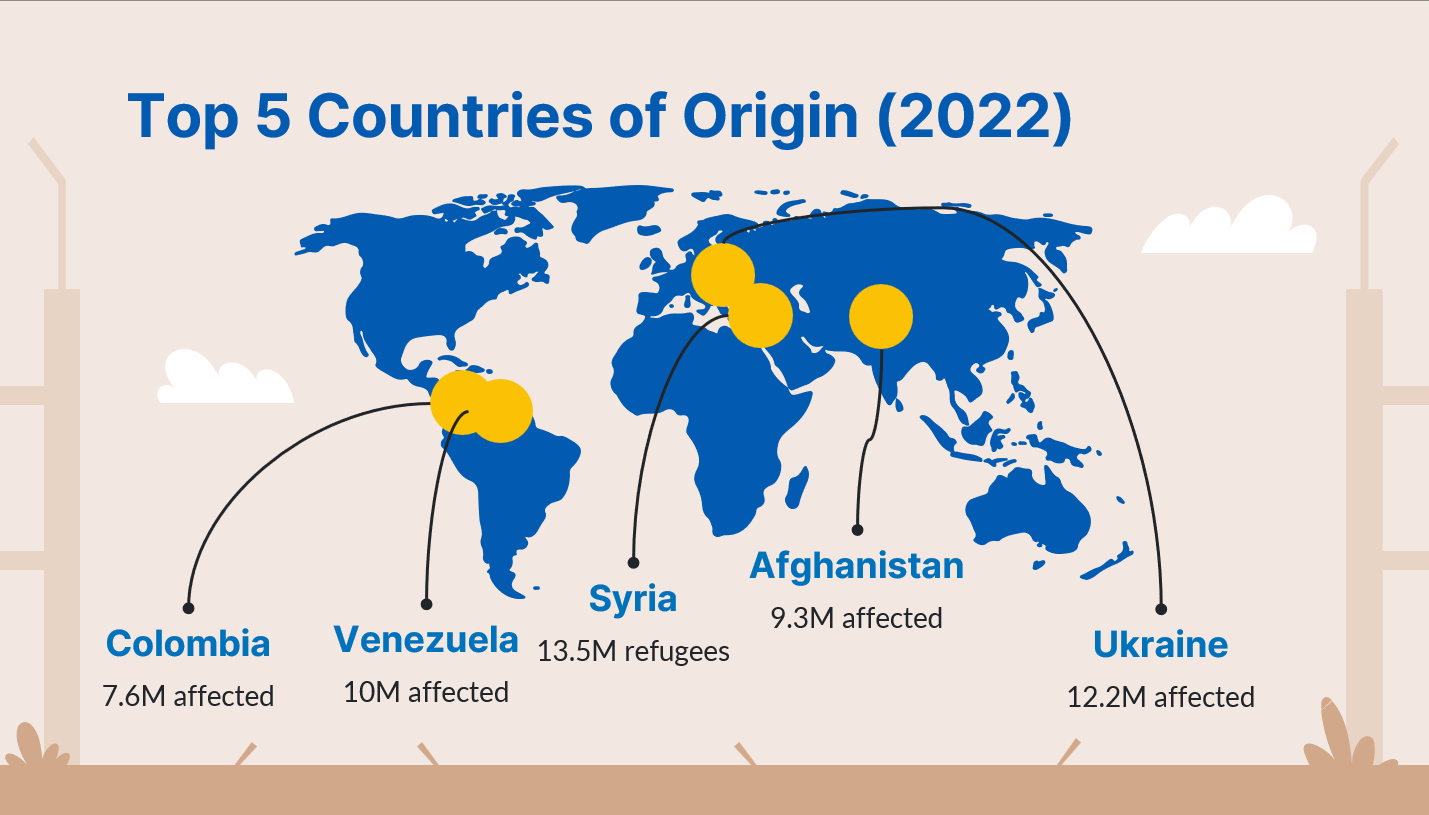
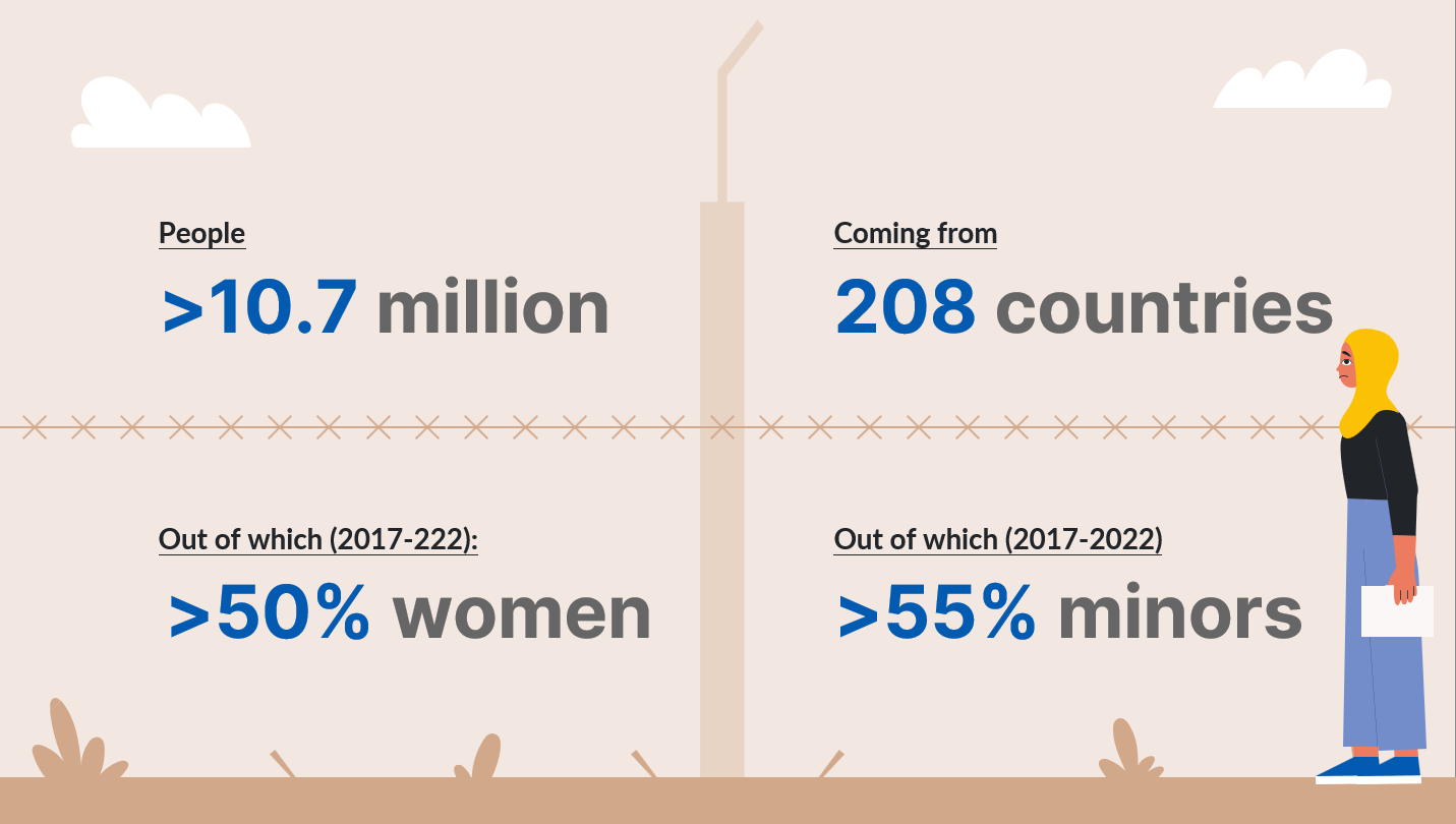
By breaking down data by year, country of origin, country of habitual residence, age cohort, and gender, the dashboard allows its users to find insights about the demographics of these groups and the
progression of displacement throughout the years. Different visualisation methods, including line charts, clustered bar charts, area charts and maps, make the source data and the underlying trends intelligible
through a glimpse of the eye to a broad audience.
Additionally, the dashboard can fuel discussions involving policy-making, humanitarian aid, and migration actors, serving as an advocacy tool. For INGOs, NGOs, local actors and refugee-led
organisations, host communities, or any entities working in humanitarian relief or migration policy, the dashboard's data can help inform where resources and efforts are most urgently needed. Moreover,
journalists and researchers will find easily digestible information, helping them understand high-level trends and steer reports or studies. The general public can also benefit by having an accessible tool
to comprehend a crucial issue affecting millions of lives globally.
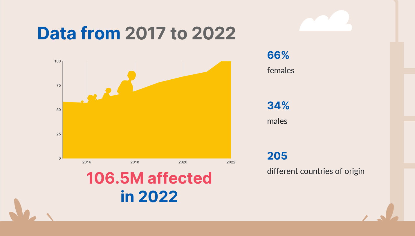
Finally, by highlighting overall trends and specific details alike (e.g., the total number of conflict-affected individuals per year and the age and gender breakdowns),
the dashboard reveals patterns that further support the overall understanding and the needed humanitarian interventions. When combined with the provided filtering and drill-through functionalities,
it allows users to explore particular aspects of the data, such as historical and racial trends and patterns of displacement.
The dashboard can be further developed to include other areas of interest based on data availability, such as poverty index and socio-economic situation or integration,
education and health metrics. Ultimately, this dashboard intends to be more than just a visualisation tool and aims to bring change to affected people's lives. The vision for the future is to
provide easily comprehensible data and valuable insights to the general audience, advocating solutions to the evergrowing displacement of people. Moreover, it aims to raise awareness and fuel
changes in the present status quo by providing reliable and actionable insights to policy-makers and humanitarians about the issue of global forced displacement. Still, it must be reminded
that this dashboard is not a panacea - despite its leverage power - and cannot serve as a standalone tool for humanitarian assistance decisions; instead, its usage should be coupled with country-specific
contextual information from people on the ground.