The Wales transportation system has followed the classic definitions of transportation as a term throughout the years (Cooley, 1894; Hall, 1999; Koilakos, 2022). The transportation system of Wales was initially created due to the need to move agricultural products, and it was also shaped by the later industrial revolution (Welsh Assembly Government, 2008; Koilakos, 2022). As it is visible in the below maps, presenting Wales' population density in relation to its topology, population density in relation to the transportation system and topology in relation to the transportation system, it becomes apparent that the Welsh transportation system is also highly shaped by the current geomorphological and demographical characteristics.
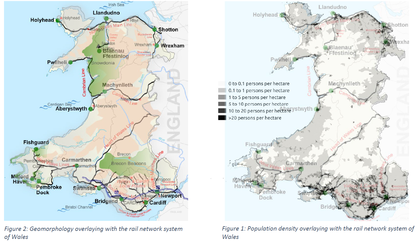
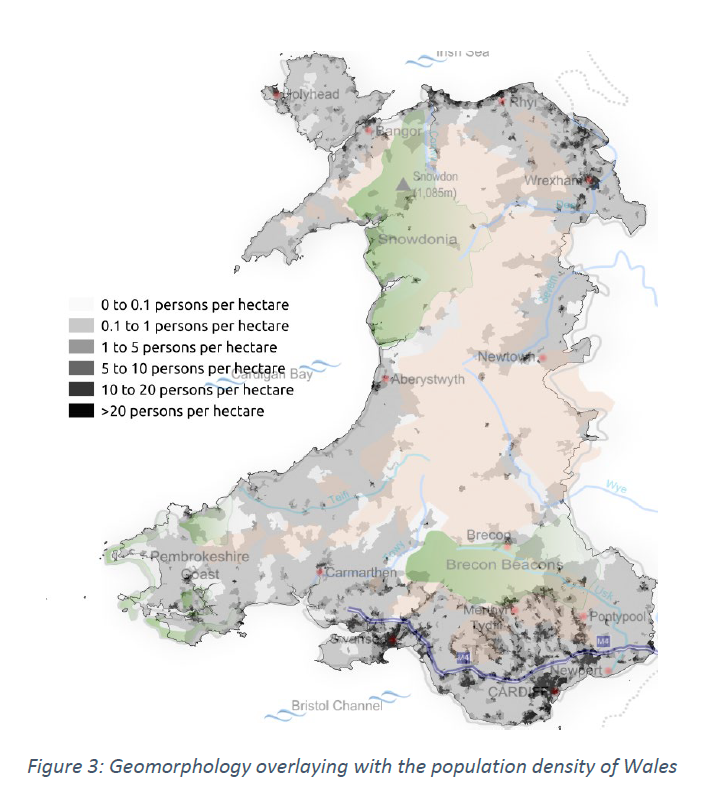
Through the available maps and related data (Welsh Government, 2021; plumplot, 2020), one can understand that the most populated regions have a more extensive transportation network, with the most extensive network being located in the South of Wales which is also the most populated of all. Similarly, North Wales also presents an extensive transportation network, while Mid and West Wales present a lack of such networks. Finally, East Wales, which is the region of Wales with the lowest number of residents per square kilometre, offers a relatively dense road network compared to the other areas, mainly due to being the port of entry from England to Wales and vice versa (Koilakos, 2022).
The National Survey of Transportation in Wales, which took place during 2013-2014 (Welsh Government, 2014), consists of 42 tables, a substitute of which will be analysed and presented in a visual format. Data pre-processing is generally performed in 5 discrete steps, which are: data cleaning, data reduction, data scaling, data transformation, and data partitioning (Fan et al., 2021). Considering the structure of the available data, which are presented in an aggregated and not a raw format, the selected tables were transferred to a new excel file to support the analysis (Dataset.xls). Moreover, data reduction was unnecessary, considering the aggregated data and the small number of rows and columns included. Similarly, data scaling and transformation were not needed as the same ranges and numerical representation (means or percentages) were used; therefore, none of the scaling and transformation techniques were necessary, as they would not provide value to the analysis. Finally, data are already partitioned, considering their breakdown in different tables. Methods such as boxplots, histograms, or scatterplots in Exploratory Data Analysis (EDA) are used in raw data, which is not applicable in our case.
After the pre-processing stage, all tables were loaded in a Python script to begin the data analysis part of the selected subset of tables. Pandas library was used and considering that tables were separated into different sheets, they were also uploaded in different data frames with distinctive names. Additionally, data visualisation libraries were used, such as pyplot and plotly. Overall, the appropriate chart type was selected depending on the available aggregated data. As an example, for data presenting discrete categories, such as table 1, table 10, table 15, table 35 and table 37, column charts were selected. For data with discrete categories, presenting proportions of a whole (generally in percentages or values), such as table 2, pie charts were selected. For data, that their specific value can only be analysed, gauge charts were selected, presenting the lower and upper thresholds (0 to 10 for our case) and the achieved mean. Gauge charts were used for tables 4 and 11 (IBM, 2022). In addition to the traditionally used charts, more advanced data visualisation concepts were also used. A choropleth map was used to present the different means of satisfaction in different public services (table 6), which colour codes the range of means from lower to higher for divided geographical areas (DataVizCatalogue, 2022). Finally, a waterfall chart, which is traditionally used for age & gender breakdowns (Humanitarian Data Solutions, 2018), was used to present different percentages of safety feeling in the male and female populations (table 41).
Specifically, on the first table (Overall satisfaction with the state of the transport system in Wales, by household type), a column chart was created, presenting visually and numerically the degree of satisfaction of different household compositions. A similar approach was followed for the combined data of table 2 (Overall satisfaction with the state of the transport system in Wales, by having use of a car) and table 15 (Have use of a car) by presenting the data in the form of a pie chart and a column chart, in an attempt to present the underlying connections visually. In tables 4 (Overall satisfaction with the state of the transport system in Wales, by urban/rural area) and 6 (Overall satisfaction with the state of the transport system in Wales, by public services footprint), apart from a gauge chart, a choropleth map was also used to present the mean satisfaction per every local authority of Wales. In particular, for the choropleth maps, Datawrapper was used, instead of python graphs, due to the limitations and peculiarities of the needed python library.
To continue with, for tables 10 (Overall satisfaction with the state of the transport system in Wales, by age) and 11 (Overall satisfaction with the state of the transport system in Wales, by employment status), due to the low number of categories presented, the graphs selected are a column chart (as the natural sequence of histographs which are the suggested graph types for ages which are not aggregated in cohorts) and two gauge charts, respectively. For tables 35 (Ease of getting to and from the hospital, by household type) and 37 (Ease of getting to and from the hospital, by employment status), due to the discretely presented categories, but also the complexity of the data, clustered column charts were created. Finally, a waterfall chart was selected in table 41 (Feeling of safety travelling by public transport after dark, by gender).
As mentioned above, for table 1, which shows the mean satisfaction by household type, the available categorical data as well as the number of the available categories, were appropriate for data visualization by using a column chart. Due to the image sizing, the categories included in order are Single pensioner (no children), Married couple pensioner (no children), Single person not a pensioner (no children), Two adult household with children, Two adult household (up to one pensioner) without children, Single parent household, Other households.
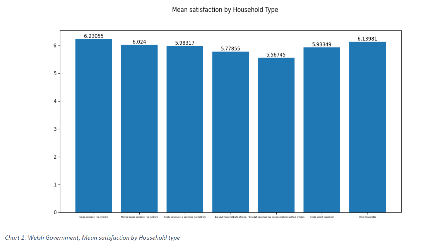
From the presented column chart, one can quickly notice the relatively low mean of satisfaction in “Two adult households without children” and the “Two adult households with children”. Moreover, two of the most satisfied household types are the “Single pensioners” and the households classified as “Other”. Due to the lack of similar categorization of household types available, the author attempted to correlate the available household types based on household estimates of Wales for 2020 (Welsh Government). The households with two adults and no children, along with households with two adults with children present the majority of the population living in Wales; therefore, one can assume that the weighted average would be different, giving even greater dissatisfaction rates than the ones presented. Even though the satisfaction rates are not justified further in the survey, improvements such as special services for families as well as special services for one common household can improve the overall satisfaction rate. Solutions such as children’s tickets or household cards for public transport may lead to greater satisfaction rates among those households. On the other hand, single pensioners, being around 120,000 of the 1.38 million households, already have discounts on the tickets, and therefore the satisfaction can be explained by that fact. Finally, data on car ownership by household type are not available, therefore no correlation can be made.
In the data presented in table 2 and table 15, which show the satisfaction by car ownership and the car ownership percentages respectively, the data that add up to 100% were presented in a pie chart to showcase proportions. The mean satisfaction by each category (having or not use of a car) was presented in a column chart through which one can understand the difference in satisfaction between persons that have use of a car and those that do not.
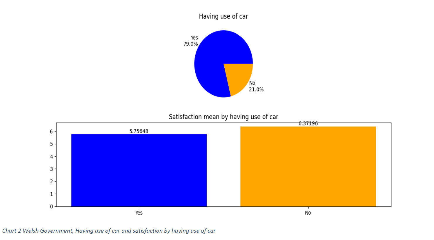
By observing the data of people who have use of a car versus the people who do not, one can understand the significant change in the mean of satisfaction by applying weighted arithmetic mean. According to the weighted arithmetic mean is calculated as (percentage_a*mean_a )+(percentage_b*mean_b)/100. By applying this calculation, instead of a mean of 6 overall satisfaction, 5.9 overall satisfaction is observed. Wales has a significant number of road closures and congestions (Welsh Government, 2021). The aforementioned fact, along with the lack of motorways (BBC, 2019), adds to the torment of motorists. With 79% of the population having use of a car, additional road work, as well as additional linking of north and south Wales, may relieve some of the frustration of drivers and improve the mean satisfaction.
Table 4, showing the mean satisfaction in Urban and Rural areas, as well as table 6, showing the mean satisfaction by local authority were analysed together. The former is presented as a gauge chart, showing where we stand and what we want to achieve in terms of mean satisfaction (under the assumption that complete satisfaction is possible and desirable) and the latter is presented as a choropleth map, showing the mean satisfaction by colour coding high and low values.
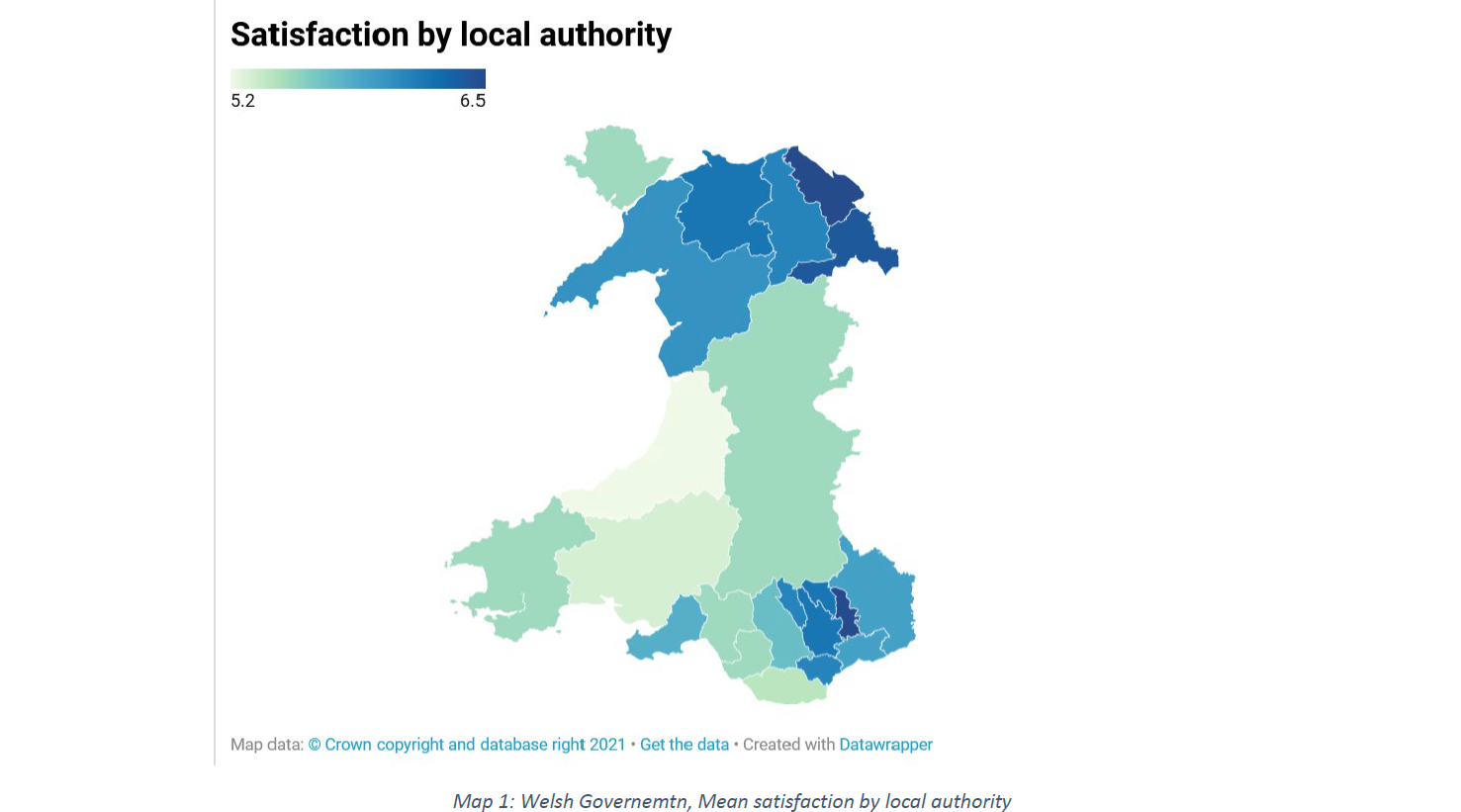
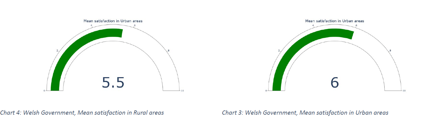
Based on the previously presented map, showing the population density by overlaying the transport network system, the lesser satisfaction in central Wales does not come as a surprise. Additionally, as mentioned in the previous paragraph, people, especially in rural areas, lack essential transportation infrastructure, affecting the satisfaction mean. To reiterate the previous suggestions, additional road work, as well as additional linking of north and south Wales, may relieve some of the frustration of commuters and improve the mean satisfaction, especially in areas such as mid and west Wales.
Similarly to the table’s one visual presentation, table 10, which presents the mean satisfaction by age cohort, is also presented in the form of column chart. On the other hand, table 11, which presents the mean satisfaction of employed and unemployed respondents is presented in a gauge chart, showing the figure in a “target to be accomplished” format.
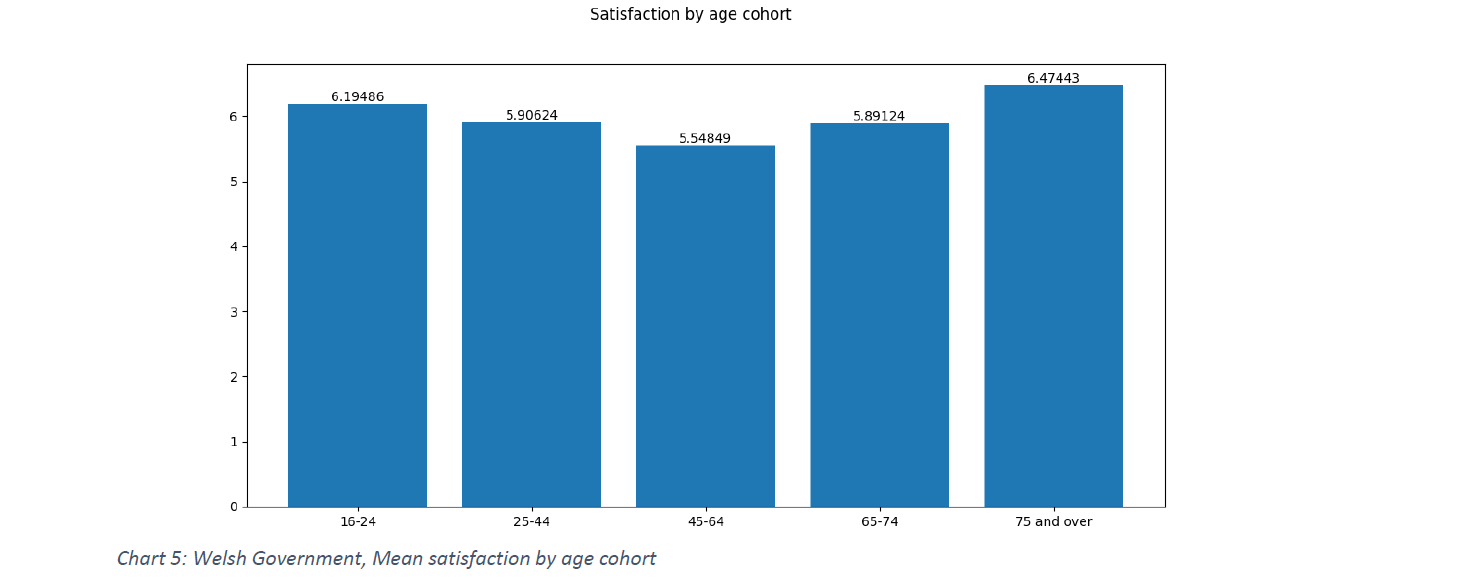
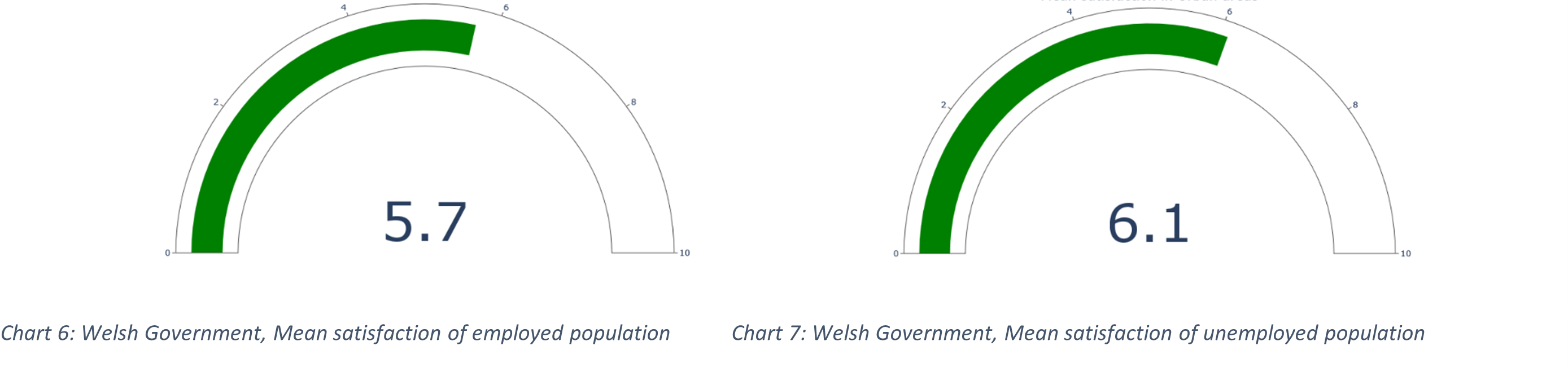
The age cohorts of 25-44, 45-64, and 65-74 present the lowest satisfaction mean, while people of 75 years old and above show the highest satisfaction mean. Persons of age 45 to 64 are one-quarter of the overall population of Wales, as well as persons of age 25 to 44, while persons of age 65-74 are 11% if the overall population, summing up to half of the overall population of Wales (Welsh Government, 2020). Apart from being a significant proportion of the Welsh population, these age cohorts are also the main workforce of Wales, with the age cohort of 25 to 64 years old being the most economically active (Welsh Government, 2021). The above characteristics of the population signify higher needs for transportation than the rest (less employable or less economically active) of the population, and, therefore, the lower satisfaction is of significant importance. Measures for working persons using the transportation infrastructure of Wales, especially for non-public transportation networks and especially for youngsters, need to be considered in an attempt to improve the satisfaction rate of persons 25 to 44 years old. Of particular importance is also the age cohort of 45 to 64 years old, which presents the higher dissatisfaction for which economic motives need to be provided, such as lower tolls for daily commuting/work commuting. The higher satisfaction of unemployed that employed population comes in support to the above argument.
Data regarding the ease of getting to and from the hospital by household type as well as by employment status are presented in a clustered column chart, which allows us to juxtapose values across two dimensions, due to the presence of colour coding. Due to the image sizing, categories are not easily visible. The categories included in order are Single pensioner (no children), Married couple pensioner (no children), Single person not a pensioner (no children), Two adult household with children, Two adult household (up to one pensioner) without children, Single parent household, Other households. An interesting finding is that persons with children but also two adult households find it reasonably easy to get from/to the hospital, while single pensioners and households characterized as “other” face difficulties and present the lowest satisfied household type in this type of commuting while presenting the highest overall satisfaction mean (table 1). The same applies to the unemployed population, which also faces difficulties accessing hospitals, even though reports a high satisfaction with the overall transportation system.
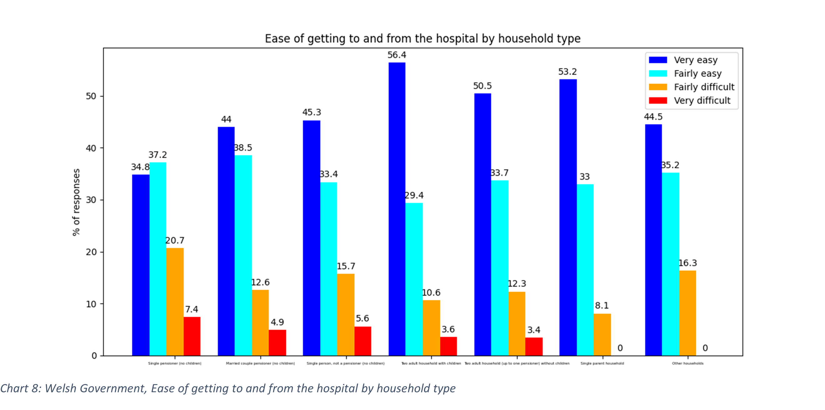
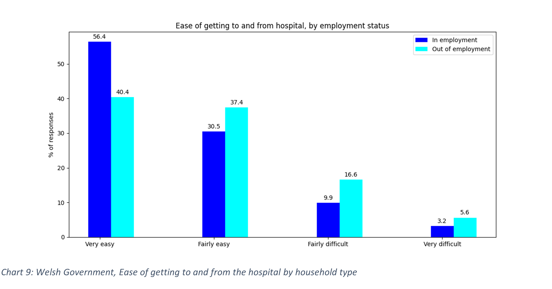
The fact that 48% of adults report longstanding illness and 35% of adults report a longstanding limiting illness shows the importance of adequate transportation networks connected with the health care facilities (Welsh Government, 2020). The Welsh ambulance service provides non-emergency services and transport through volunteer car drives, but this is not enough. Creating better public transportation connections and providing alternate transportation options for regular appointments (e.g. for dialysis) can also be covered through the NHS with the using pre-paid taxi drivers or hospital dedicated transport (e.g. mini-bus). The non-employed population also finds it somewhat difficult to access hospital services, for which the above-suggested actions can also be beneficial.
Finally, table 41, which presents the feeling of safety per gender, is presented in a waterfall chart (bar chart with inverted axis for one of the two bar charts), which allows us to observe data points horizontally and vertically.
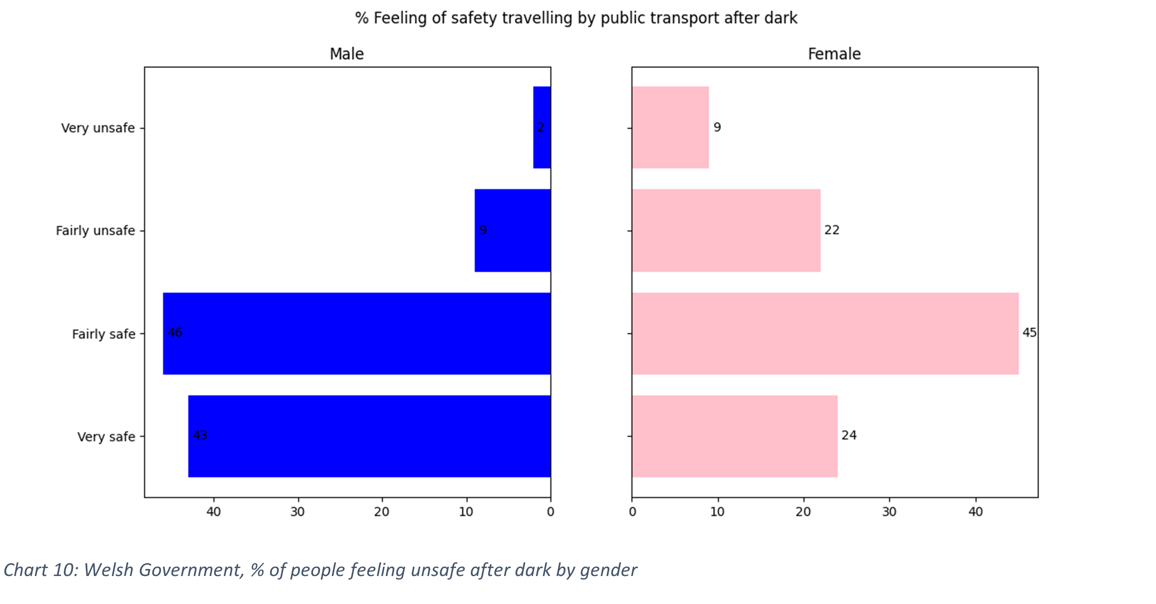
Wales have 110% of the national crime rate and nearly 37% of the crimes are characterized as violent (plymplot, 2022). Having the above-mentioned negative statistics on the crime rate, it does not come as a surprise the feeling of unsafety that one-third of women and one-tenth of men feel after dark. Some of the suggestions that can help in reducing crime rate and consequently improving the feeling of safety are reducing policy violence, creating civil society organizations aiming to battle inequalities and creating bonded neighbourhoods, as an holistic approach, which shifts away from regular policing measures (Love H., 2021). In addition to those, better lighting, predictive policing, close public transportation stations with steady police presence are also some of the measures that can help on giving people the feeling of safety.
To conclude with, the Wales transportation system serves to some extend the people of Wales. Specific groups (such as specific household types, specific age cohorts, vulnerable population in need of health care and women), having specific needs are not served well by the general-purpose transport system, even though some of those groups present a large proportion of the Welsh residents. Infrastructure, economic motives, improvement on the provisions for people in need and better combating crime are only some of the interventions that will bring greater satisfaction to the Welsh.